How to Read Paint Samples in Daylight, Lamplight and Shadow
Read paint samples in daylight, lamplight and shadow to spot undertones in your actual room and choose a color that feels right across its changing light.
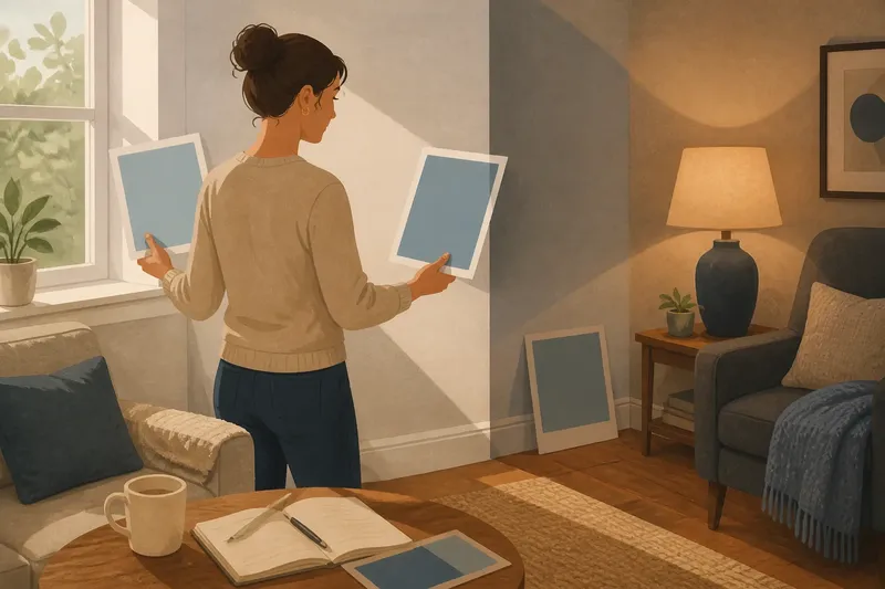
A paint sample beside the window can look creamy at breakfast and noticeably different beside the sofa that evening. To read paint samples in daylight, lamplight and shadow, compare the same color in the places and lighting you actually use.
Light and nearby colors change how paint reads
A painted surface reflects the light reaching it, and your eye sees that color alongside everything around it. Daylight changes as clouds pass or the sun moves; lamps add their own color cast. A shaded area may make a sample look more subdued than a bright wall does, but the result depends on the room and its surroundings.
Floors, rugs, furniture, and views through windows can also affect how a paint color appears next to them. A pale neutral against warm wood may seem different from the same sample beside a cool gray curtain. These comparisons describe the color in context, not a change to the paint itself.
Check the sample near the window and farther into the room before deciding what its undertone is.
Compare paint samples in daylight without relying on room orientation
Rather than assuming a room’s direction predicts its light, observe the actual conditions in your space. Nearby buildings, trees, window coverings, weather, and the position of the sun can all affect what reaches a wall.
Place a sample board near a window, then move it to a wall farther away. Look at both spots when daylight is bright and again when it is softer or the sun has shifted. Avoid judging only in direct glare, which can make a sample hard to compare with nearby surfaces.
Notice how each sample sits beside fixed features such as the floor, trim, and window frame. Write down what you see, such as “looks pink beside the floor” or “seems cooler near the trim.”
Check the color under your usual lamps
At night, switch on the lights you commonly use. A bulb’s color appearance, the lamp shade, and nearby surfaces can all affect how the sample looks. Do not assume every warm or cool bulb will produce the same result; inspect the actual lights in the room.
Compare the sample with a reading lamp alone, overhead lighting, and any combination you regularly use. If you have a dimmer, include the setting you normally choose. Decide whether you like the color’s evening appearance rather than expecting it to match daylight.
Use the lamps you live with, not a lighting setup you rarely turn on.
Look at paint samples in shaded areas
Check a shaded wall, the space behind a door, and an area beside a tall cabinet or curtain. These locations show how the color reads without the brighter light found near a window. A sample may look quieter there, or its undertone may become easier to notice.
Keep a sample board flat against the wall so it receives light similarly to the painted surface around it. If a strong shadow crosses the wall, compare the sample on both sides. This helps you see whether the color suits the room beyond its brightest area.
A shadow is part of the room’s appearance. Use it to decide how much variation you are comfortable seeing.
Choose sample locations that represent the room
Use a few spots with different conditions: near a window, across the room, and in a shaded area. If the space has distinct uses, such as a desk nook and a seating area, include both. Keep the board clear of strong reflections when you want to judge the paint color itself.
Large sample cards or movable boards are easier to compare than tiny chips. For paint applied to a wall, prepare the surface according to the product directions. Follow the label for peel-and-stick samples, too.
Move one board among locations when you want to compare how its appearance changes. Use separate boards when you want to see two colors side by side under the same light.
Use these checks to decide what to do next
- Check whether a sample looks appealing near the window; if it does, keep it in consideration, but if glare makes it hard to judge, move the board out of the direct beam.
- Check whether the color still suits the floor and trim farther into the room; if it does, note that pairing, but if it clashes, compare another shade beside the same fixed features.
- Check whether the sample keeps a character you like in the darkest usual corner; if it does, retain it as an option, but if it feels too heavy, try a lighter color from the same family.
- Check the sample under the reading lamp you normally use; if the evening appearance works, record it, but if it does not, compare another sample under that same lamp.
- Check whether a nearby rug or curtain seems to alter the sample’s appearance; if the combination feels balanced, keep both in view, but if it feels discordant, assess the sample beside another permanent surface before ruling it out.
- Check whether two candidate colors are difficult to distinguish from memory; if so, place both boards side by side under identical light, but if they are already clearly different, compare each in the room’s other light conditions.
How should I compare samples before choosing?
How often should I look at a paint sample?
Check it during the daylight conditions you commonly experience and again with your usual evening lights on. Include the shaded places where you spend time, rather than relying only on the brightest wall.
Should I paint a sample directly on the wall?
A movable board makes it easier to compare locations without changing the wall surface. If you apply paint directly, follow the manufacturer’s preparation directions and compare the sample against the surrounding room in more than one lighting condition.
What if two samples look almost identical?
Put them side by side in the same location, then cover one at a time to make their differences easier to notice. Repeat the comparison under the lights that matter most in your room.
Should I choose the color that looks best by the window?
Choose based on the room as you use it, including its shaded areas and evening lighting. A window-side view is useful, but it does not show how the sample will look everywhere else.
Work through one comparison from start to finish
Say you are choosing between two muted blue samples for a living room with a bright window and a shaded reading chair. You label two movable boards “Blue A” and “Blue B,” place both beside the window, and note that Blue A looks clearer while Blue B looks grayer. You move the boards across the room and see that Blue A looks more subdued by the chair, while Blue B remains quieter. In the evening, you check both under the reading lamp and the overhead light, recording which appearance you prefer in each setup. Your resulting choice is a tradeoff: select Blue A if its brighter daytime look matters more to you, or Blue B if you prefer its steadier, less vivid appearance in the spots you use. The notes describe this invented comparison, not a test or a prediction about every room.
Keep notes specific: “gray beside the chair” is more useful than “not quite right.” If a sample changes in a way you dislike, check whether the effect appears in one location or across the room. A shift limited to one surface may point you toward comparing other colors beside that surface; a shift you dislike under every usual light may make another sample worth considering.
Decide when you have seen the sample in your usual conditions
A sample is ready for a decision when you can describe what you like and dislike about it near the window, in a shaded area, and under the lamps you use. It does not need to look identical everywhere. You need a clear sense of whether its changes suit the room’s fixed surfaces and daily use.
Before choosing, return to the least flattering spot for your preferred color and look once more. Reading paint samples in daylight, lamplight and shadow this way gives you a more useful basis for deciding than a single look beside the window.